Graphique de la rue: A typographical fount of inspiration
Design may be thought as the art of using and arranging elements (such as typography and images) to convey information persuasively.
Design is relevant to the technical aspect of communication management.
First and foremost because we, as human beings, are visual emotional creatures. Despite the oft-projected images of staid stale office workers (á la “Dilbert”, Scott Adams’ wickedly accurate satire on office life), humans by mysterious design (pun intended) have a sense of aesthetics.
It is why a ring wrapped in yesterday’s newspaper makes far less of an impact than the same suggestive ornament set in velvet and clothed in gold or silver tissue.
Design is often the vehicle to deliver the message in a persuasive manner. It captures the eye and, by anticipative extension, the attention of the intended audience.
Of course this means that good design increases the persuasiveness of the message.
Designers in particular and creative people in general look for inspiration in the world around them – in art, literature, music and nature.
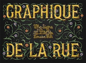
So when we came across this delightful book, “Graphique de la Rue”, we had to share it with our creatively inclined kin.
Over her many sojourns to the City of Lights, Louise Fili photographed the signs and typography that are quintessentially Parisian.
From
- the classic elegance of the verre églomisé on Pâtisserie signs;
- the ornate écritures in the Cinzano or La Cupole signs;
- the Italian-inspired mosaïques of Swann and Bon on the rue de Rivoli;
- the Art Déco of the 1920s in Folies Bergère (a style which also features in one of our favorite televised period mystery series, Poirot);
- the neon signs for Cinema le Champo;
- the monograms for the Hôtel Wagram;
- art nouveau architect Hector Guimard’s striking entrances to Paris’ metro system (quite different in mood from the restrained signs for the London Underground);
- the enameled blue-and-white street signs that typify Paris;
- the architectural letterforms used by perfumer Dorin and by École Normale Supérieure;
to
- the sans mots signs used by eyeglass vendors, tobacconists and restaurants that rely on images rather than words to convey the nature of the business;
Fili’s largely visual book is a delight for designers and anyone interested in font typefaces and the cultural history that birthed them.
We found this browsing in the design and architecture section of our local library. We hope it is a fount of inspiration for the aesthete in you.
***
This post was written by Raaj Chandran, executive director and chief consultant for Verafluenti Communication Inc.
We solicit your feedback to this post. Please use the “Leave a Reply” form at the end of this (or any other post) to make a public comment, in adherence to our blog etiquette. Or if you prefer, you can email us in private at contact@verafluenti.com.
Print-ready versions of several blog posts are available in our store for a small fee.