Lessons in communication from the street

It is said there is no university and no teacher better than life itself. Word!

Some of the most striking and creative lessons in communication come from the street.

The street: This is the frontline, where your ideas are brutally tested by the pavement, the indifference of the time-pressed layperson, and the concurrent pull of multiple competing distractions. It is an unforgiving trial ground where ideas and people either soar or crash-and-burn; it separates the wheat from the chaff.


The ‘good citizen’ sales pitch

I remember a firsthand example of a brilliant sales tactic employed by a homeless person on High Street. Twenty years later, his pitch is still poignant in memory.

“Don’t have a home. Don’t have no money. Can’t find me no job. Don’t want to steal. Don’t want to sell drugs. All I need is a happy meal to keep me happy. Just $1.99 is all it takes to keep me from a life of crime. Can you help me out?”

The pitch made students smile and stop in their tracks to talk to the chap, if nothing else. On most days, he managed to wrest enough meals out of his audience to be and look well-fed!

I suspect he took his act to different parts of the city, when he felt one area had been saturated. He may well have been a farmer, leaving land fallow so it would recover its fertility for a later planting and abundant harvest. From a communication management angle, this is not unlike scheduling the message intelligently.


Handwritten attention-grabber

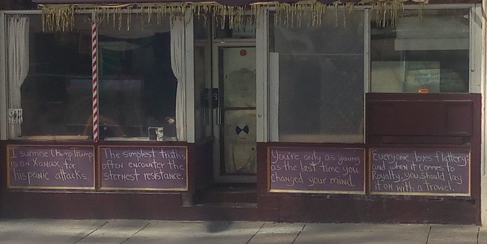
Recently I came upon a lesson in communication from downtown Calgary. These words of clarity and honesty doused in humour were written in chalk on the front of a building in disrepair, right opposite a train station.

Without the well-intentioned but usually paralyzing censorship of the corporate marketing, PR and legal squad, these words had an instant impact, drawing at times a smile, a chuckle, a gasp or an oh-no-you-did-not-just-say-that look.

StreetCommunicationCalgary

These handwritten messages are probably much closer to the cave art and writings of yore, which are among the first forms of printed communication (“print” is reportedly derived from the Old French word “preindre” associated with the Latin root “premere” meaning “to press” and create an impression).

It is comforting and marvelous to see that, despite hard glass touch screens, social media and virtual reality, the simple friction of a hand-wielded instrument on a surface is still powerful and effective. This basic and primeval form of communication has persisted through the 200,000 odd years that humans have existed on the planet –connecting us with our cave-dwelling ancestors!

I wonder if the same would be said of computers, iPhones and tablets in centuries to come.


Street theatre and wordless pictorials

There is a form of theatre in rural India that performs in street corners and alleys — with little or no props, effects or ambience. The performers rely purely on histrionics, raw sound, dance, and songs — rendered on the most basic instruments not requiring electric inputs or amps – to deliver social messages. In many instances, they break the fifth wall to involve the audiences. It is an art form used to raise awareness of socio-political issues and to instigate change. They work because of the real-life situations they refer to, the vernacular dialect they use, and the music of the street that are familiar to and endear them to their audiences.

These performers often risk life and limb while highlighting truths that are uncomfortable to political autocrats – a consequence which testifies to the effectiveness of their communication.

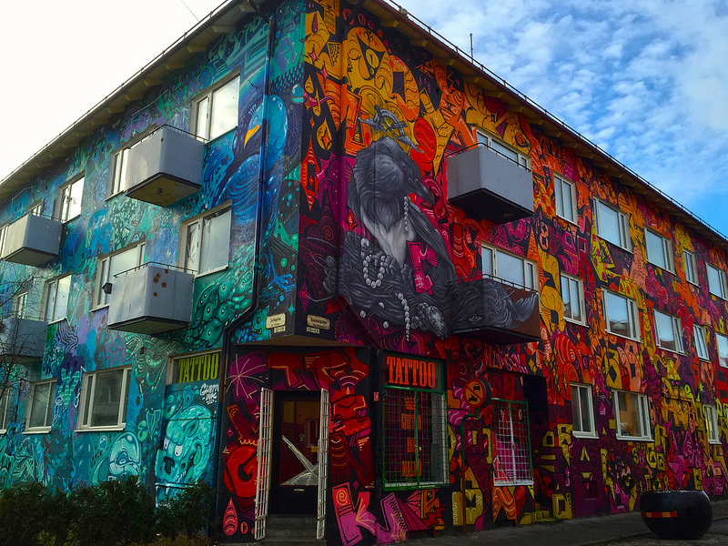
Many cities in India are using street art to offer a physical and psychological facelift to residents, with conceptual images conveying a recommended action.

On pavements crisscrossing university greens and outside lunch halls and libraries, creative student campaigners have scrawled witty messages in chalk to hook the downward gaze of student pedestrians. Of course this was before smartphones assaulted the senses and turned people into dumb screen-staring robots.

In fact, on many an occasion, such communication may not even require words. A symbol or iconic image and the choice of colours can drive a message hard.

For instance, in several European cities, Internet Samaritans offer free open wi-fi access to all and sundry. In the opening years of this century, such availability was communicated by “warchalking”, the practice of drawing symbols in chalk to advertise free hotspots. Now “apps” have steamrolled this quaint nicety as well.

In South America, street art emerged as the primary form of expressing protest, led by the murals of Diego Rivera and Jose Orozco. 

Britain’s reclusive artist Banksy has spray-painted walls in Barcelona, Bristol, Detroit, Paris San Francisco and Vienna. Starting with graffiti, he progressed to canvas and sculpture, always provoking people to think. (For more information on creative art by Banksy and others, please visit www.artsy.net/artist/banksy)

The Polish duo Etam Cru create large striking colourful surrealist murals that draw on Eastern European mysticism and folkloric symbolism, and are often infused with irony, sarcasm and humour.

In all such instances, heightened true creativity overcomes the limitations of a miniscule budget.


The Verafluenti aperçu

Corporations and its marketing and PR departments can learn much from such examples from the street.

Truth, wit and honesty always win attention. Stale corporate directives clothed in repulsive jargon punctuated with unfunny jokes make no impact, because they are dishonest, pretentious, ambiguous and boring.

Most people won’t remember the so-called core values of all the places they worked at, because, let’s face it, most of them are the same with a few minor differences.

Most people won’t remember the goals and priorities of all their employers, because honestly, they make no difference to most employees who are more concerned about getting a pay cheque in time and paying their bills.

But almost everyone will remember an offbeat, honest, courageous-if-foolhardy email sent to all staff by some millennial. I can recall a few such instances that have since passed into corporate legend, including a hapless new employee’s global email invitation to lunch, frequent all-staff emails about food items stolen from the fridge, and personalized mugs that mysteriously moved from the floor of their owners to distant corners of the corporate universe.


Endearing traits of street communiqués

Why is it that these stay in one’s memory when the “meeting-the-changing-needs-of-our-clients” pomposity doesn’t?

One, they are witty.

Two, they are visceral and as such evoke a visceral (and thereby real) reaction from the audience.

Three, they usually subvert the staid (and artificial) façade of the corporate sensibilities. And secretly, employees love it when the powers-that-be are given a good rattling. Magicians often employ this technique – picking a known authority figure as a volunteer and then tricking the heck out of them, to rousing applause.

The suggestion is not to encourage mutiny or subversion of corporate priorities or sensibilities. Merely that, it is all right to poke fun at yourselves occasionally. It makes senior executives seem more human. And humour, used discreetly and tastefully, is an icebreaker that dismantles your audience’s barriers, making them more receptive to your messages.

Four, they make one think. And thinking is an important first step on the journey to impact. We will talk about impact versus implementation measures in another post. But for now, let us just say that impact is what the intelligent communication practitioner desires from a campaign or communiqué.

Five, they are usually not limited by rigid corporate templates, many of which suck the soul and joy out of life.

Street communication is of course prone to the practical limitations of the medium, and the medium itself. But such limitations are physical; they do not hinder the creative spirit. For example, the wall which forms the canvas of a communiqué stipulates physical restrictions of height, width, texture, exposure to the elements etc. But it does not restrict the creativity of content that is born within these physical limitations.

This is a significant point of difference between street communiqués and ineffective templated corporate messages.   


Good content moves cross-media

There is also the possibility of content in one medium being promoted in other media.

For instance, when chalk-written messages are photographed and propagated via social media, then what was print becomes electronic and social.

But what motivated the sharing and the crossing over into other media is good thought-provoking content.

It is perfectly feasible for corporations to adopt this idea – encouraging creative expression in one format, and then sharing it in others for a wider reach. However poor content garbed in inaccessible argot will fail in any medium. This is where I would differ from the McLuhian contention that “the medium is the message”, particularly in this era. (By the way, the Alberta-born Marshall McLuhan, is a personal favourite for his uncannily accurate vision of the future of media, and the delightful zany pun-filled language he uses.)

The message must be clear, well-crafted and engaging. No medium can truly make poor content effective.


Technology does not constitute content

Many are the companies that tout (with furiously-wagging tails and panting tongues) technology as the holy grail of corporate efficiency. And by technology, they largely mean computer software — manifesting as programs and applications – and related hardware.

They quote, commission and distribute studies, surveys and polls, mongering fear that executives who don’t automate every aspect of their business with technology had best prepare a dirge for the early and certain demise of their enterprise.

But one wonders: If technology is the grand panacea and the promised path to corporate paradise, then what happened to the dot coms that were founded on technology? Why did they go bust? Did these technology enterprises not have enough technology?

I view technology as an enabler not the protagonist in the organizational tale. To place it front and centre would be rather batty and ill-conceived.

It would be celebrating the tools of carpentry while forgetting the carpenter whose craft creates articles of utility and aesthetics. It would be like deifying the tubes of oil paint, the paintbrushes and the easel, while erasing the very artist whose creativity produces unique affecting pieces. 

Again: Technology cannot make poor content effective.

For those who feel this sounds good in theory, but is not practical for your organizational systems and processes, then as a parting thought, may I highlight this line from the downtown Calgary chalkboard: “The simplest truths often encounter the sternest resistance.”

And isn’t that the deep and simple truth!

* * *

This post was written by Raaj Chandran, executive director and chief consultant for Verafluenti Communication Inc.

We solicit your feedback to this post. Please use the “Leave a Reply” form at the end of this (or any other post) to make a public comment, in adherence to our blog etiquette. Or if you prefer, you can email us in private at contact@verafluenti.com.

Print-ready versions of several blog posts are available in our store for a small fee.


White space: An essential in communication and life

White-space-purple-dot-600px

Not an inch of space is to be left unused. Text and images should cover: the page, billboard, print canvas, web space, and all too often, a PowerPoint slide. Voices and sounds should constantly blare the corporate message during every second of radio messages. Graphics, animation and visual effects must occupy every second of TV and web communication.

This is the directive communication practitioners oftentimes receive. Of course, one cannot really blame the folk upstairs. Much like everyone else, they are making decisions using what they know.

Looking at it purely from a financial angle, it might appear logical to conclude that empty space has no return. After all, empty bank and investment accounts usually do not lead to better returns.

Fortunately and aesthetically, the rules of finance do not hold much sway in design.

Any studied practitioner will know – what experience will have corroborated – that PR and communication campaigns need white space and silence to be effective.

Some draw a distinction between “active” and “passive” white space — active being the white space created intentionally for balance, organization and emphasis; and passive the white space that occurs naturally such as the space left out at the borders or in between content. We acknowledge and embrace both.

May we also remark that white space is not always “white”. The term merely signifies absence of content in a space that may be infused with a single colour, or a concoction of colours.


Increasingly intrusive barrage

Many executives and managers may believe the way to get messages across is to inundate audiences or publics with them.

Eager to please them, the PR managers (who in such instances function more as technicians than as strategists) try to create new distribution vehicles.

Such a spiral has resulted in several unique (and admittedly creative) formats.

At one point, pre-recorded voicemail messages from senior executives would greet unsuspecting employees when they picked up the phone intending to reach a business client or quite simply do what they were hired to do.

The new-message-indicating red light would refuse to die till one had sat through the 60-120 seconds of artificial-sounding spiel. Few people (save the ones in their probationary period) listened to or even heard (there is a difference) these messages, making them a waste of effort and time for the executives, the PR practitioners and the intended audience.

When the notice board is covered in years’ worth of unmanaged layers of stapled-over posters, the practitioners invest in digital signage, applauding the corporation and themselves for adopting a more “sustainable” medium (more on this in another Verafluenti post, coming shortly).

Novelty can pique audience interest for a while. But soon attention wanes and the “new” medium also lands on par with other media that have come before.

Unless good content with good design is issued, addition of new formats will not go very far.

When executives complain that “people aren’t getting our message”, the distraught PR practitioners put up digital screens in the elevators, the pantries, the lunchrooms, the coffee machine (yes, even the dispenser of your hallowed daily Joe is not immune), and the washrooms.

The day may not be far when messages are beamed in virtual reality into the hitherto sacrosanct peace of one’s bathroom stall. Picture yourself being educated in the corporate core values while easing your bowels. Quite the unholy congress, n’est-ce pas?

The guiding idea is seemingly to not allow the poor audience a moment’s peace.

Unfortunately for management, this may elicit an undesirable response – of disgust and irritation – causing audiences to tune out, or worse, reject messages. This is similar to the “recall and reject” of annoyingly memorable commercials. Please read the Verafluenti aperçu in our post on “The 100 Ideas That Changed Advertising” for more.

People need their personal space, personal time and white space – which, in communication terms, would translate into relief from the relentless message blitz.

To manage the intensity of message dissemination, campaigns use techniques like pulsing and flighting. While this is significant and helpful in creating a white space relative to an organization’s presence in the larger message dissemination scape, it still does not constitute white space or silence within an individual communiqué.


Jarring overload within a frame

White space is required in communication and PR campaigns. It must also be present within each communication piece.

But as above, so below.

The mindset espoused by senior executives influences all aspects of organizational culture, including the design of each printed piece, electronic poster or digital screen.

A single digital screen can simultaneously contain scrolling news bars, weather information, popup sports scores, Flash animations, corporate news and more.

A critical look at the TV screen during a newscast will bear this out. In addition to the above-mentioned elements, most news programs also have a background in constant motion and animation, creating more visual confusion.

Communication and media appear to be propelled by a fear of stillness, white space and silence. It is almost as though they would lose their audiences (and, by the extension of financial motive, their grip on their wallets and purses) if they stopped clanking their pots and pans for even a second.

Attention is constantly diluted, and the eye persistently tired out by so much activity. It is conceivable that, in addition to the dismal quality of TV content and its disproportionately extortionist cost, the lack of a sane space may be pushing more people to cut the cable TV cord.


It’s the corporate template

Even seasoned graphic designers have been known to stomach poor design in the name of corporate templates (even though they may be ill-designed by people with no inkling of the discipline).

Well-intentioned practitioners who point out the violation of design principles are met with defeated smiles and an acceptance of “the way things are done here”.

Suggesting the implementation of good design and communication principles is sometimes seen as not toeing the company line and as not being a team player.

There is also no dearth of inexperienced, unqualified, yet supremely cocky, self-appointed brand police who will parrot “on brand” and “off brand” without stopping to examine whether the brand itself is founded on valid fundamentals. Such characters do more harm to the organization – knowingly or unknowingly.

Sadly, the specters of bill payment and mortgages can have a depressing effect on the advocacy of proven tenets.


The Verafluenti aperçu

White space and silence offer contrast for the eye and for the ear. They provide a point of reference, which allows the audience to concentrate on the message. In the absence of white space and silence, it becomes difficult to discern where one ends and another begins, in the endless tirade of corporate and commercial messaging.

This example of complete clutter demonstrates how the lack of white space can be jarring and straining to the eye, while also ensuring that no message is retained.

This website for car leasing in the United Kingdom, not content with visual clutter (and web design whose existence is unbelievable in this day and age), also adds syrupy songs on autoplay. Audio clutter on top of visual chaos for a supposedly authentic business!

As salve for your eyes, compare those to the clean layout of this retro VW ad or this Southwest Airlines ad. There is also a reason for Google’s minimalist design.

It works.

It is also a reason we keep our Verafluenti design clean and simple. It is why we don’t have auto-rotating picture galleries, Flash intros, fancily animated menus, or sticky scrollbars on our website.

White space helps to make visual messages clearer, more inviting and more accessible – which means more people will absorb and understand the message. There will then be real impact, not just dissemination and exposure.

Senior executives are the most powerful cultural influencers in an organization. As such, they can play a role in championing more effective communication practices – such as the use of white space for better design and for better campaigns.

For this, a degree of exposure to the relevant discipline would be helpful. This can be gained through personal study of leading publications in the field, by enrolling in an executive education course, retaining a consultant (such as Verafluenti) to conduct a seminar, or simply (and very cost-effectively) by asking their inhouse PR practitioners to run a session on design principles for senior managers.


The value of emptiness

White space is essential not just for effective and aesthetic graphic design, but also for other facets of life. The most beautiful musical compositions are the ones that contain silence within them.

Emptiness is not a vice to be weeded out.

More than the walls and the roof of a house, it is the empty space within that makes it livable.

It is the emptiness inside a vessel that makes it a useful container.

It is the emptiness that was mathematically captured as “zero” – by Aryabhatta circa the fifth century CE and formally by Brahmagupta in the seventh century CE — that adds value to a number.

Emptiness is openness — to springs of creativity, knowledge from unknown fountains, and virgin world-changing thoughts.   

It is also conjectured that the universe was conceived in silence.

The silence of the mind – or the state of no mind – is of course called meditation.

Medical studies and brain imaging sessions have shown that a quiet meditative state is more focused, clear, creative and taps into the brain’s massive unused potential.

If it can do so much for an individual human being, why can it not find its (very logical) way into design, the views of senior management, design of communiqués, and the practices of PR managers?

Too much to ask … or simply too commonsensical?

***

This post was written by Raaj Chandran, executive director and chief consultant for Verafluenti Communication Inc.

We solicit your feedback to this post. Please use the “Leave a Reply” form at the end of this (or any other post) to make a public comment, in adherence to our blog etiquette. Or if you prefer, you can email us in private at contact@verafluenti.com.

Print-ready versions of several blog posts are available in our store for a small fee.


“100 Ideas That Changed Advertising”

100_advertising_cover_3d_1[1]

Advertising is always of interest to any PR or communication management practitioner. The discipline allows for immense creativity which has manifested itself in several memorable advertisements over the decades. The creative allure apart, from a PR or communication management perspective, there has always been some overlap with advertising and marketing.

This is little wonder as PR is often referred to as the boundary spanning function, meaning it has to maintain contact, work closely and align its efforts with several other business departments including marketing, people and legal counsel.

PR and advertising campaigns involve similar elements of creativity, graphic design, visual appeal, and a call-to-action, the main difference being that PR aims to build relations and not just make a sale. Both tend to be persuasive in nature, but with different goals. The good relations and goodwill that PR is capable of building can often create a conducive environment for a commercial transaction to take place. But sales are not the main thrust of PR. For more background, please read our post titled “PR, marketing, advertising: Making sense of the confusing mélange”.

This interest is what led us to “100 Ideas That Changed Advertising” by Simon Veksner, Creative Director at DDB Sydney, published in 2015 by Lawrence King, London.

It lists, in chronological sequence, the development of commercials through the ages:

  • The humble poster used by ancient Egyptians and found on walls in the volcanic-ash-preserved ruins of Pompeii; and which continue to this day. In fact in many parts of India, entire walls are sprayed with campaign propaganda during election season.
  • William Caxton printing one of the first leaflets in 1477 offering “Pyes of Salisbury … to any man spiritual or temporal to buy”. The “pyes” referred to clerical rules rather than savoury pastries. Leaflets, handbills or flyers endure due to their directness and immediacy.
  • The Boston News-Letter in 1704 being the first newspaper to carry advertising – the first ad offered a reward for the capture of a thief!
  • James Gordon Bennett’s (publisher of the New York Herald from 1835 to 1867) innovation to change ads every day just like the news, prior to which companies often ran the same ad for a year.
  • The 1842 opening of the first American ad agency Volney B. Palmer in Philadelphia.
  • The founding of the first full service agencies by James White in London in 1800; with N. W. Ayer & Son being the first in the United States in 1869.
  • Catalogues which can be traced back to 1498 when publisher Aldus Manutius released a catalogue of books for sale in Venice.
  • Topical ads that relate to a current event or time of the year. One of the longest-running topical ad campaigns is the association of Coke with Christmas. Starting in 1931, magazine ads for Coca-Cola appeared at Christmastime, featuring Santa as a kind, jolly, rotund man in a red suit drinking a Coke. Before this, there had been no set depiction of St. Nick – he was sometimes tall, thin or elf-life. Today when people think of Santa, they think of the image created for him in Coca-Cola’s advertising.
  • Product placement, which began with paid mention for products in 19th century novels, the Lever Brothers placing their soap products in some of the earliest movies in the 1890s, its growing popularity in the 1980s, such as Ray Ban sunglasses featured in Tom Cruise’s Top Gun (1986), which generated a 40 per cent increase in sales.
  • The growth of slogans, called endlines or straplines in the UK, or taglines in the United States. The earliest advertising slogan may have been for Ivory soap in 1879: “99 and 4/100% pure”. It is revealing to learn that McDonald’s “I’m lovin’ it” slogan, was in fact created by a German ad agency, Heye & Partner, as “ich liebe es”.
  • Cinema advertising starting as early as 1897. The first known cinema ad featured men in kilts dancing in front of a banner advertising Dewar’s Scotch whisky. Advertisers soon got leading directors to produce visceral atmospheric ads such as Michael Mann helming Lucky Star, the 2002 slick cinema ad for Mercedes, that also innovated by screening during the movie trailer sequence and not the ads.
  • Creative and memorable copy, some of which was written by people who later achieved fame, such as the slogan for a TV ad for cream cakes: “Naughty. But nice.” which was written by Salman Rushdie.
  • The rise of stock photography as an industry in its own right, from Robertstock, founded in 1920, to the now-merged Corbis and Getty Images, which between them have 180 million images, 500,000 video clips, and 50,000 hours of film footage.
  • The infamous and misguided 1921 prediction by a group of investors: “The wireless body has no imaginable commercial value. Who would pay for a message sent to no one in particular?” And yet, today, 95 per cent of the world’s population listens to the radio.
  • The first radio advertisement broadcast in 1921 by WEAF in New York – a ten-minute talk for a real-estate firm, for which the station charged $50.
  • The birth of jingles in the 1920s during the early years of commercial radio. They used simple repetitive nursery-rhyme-like messages that not only communicated a product’s name and message, but also stuck in people’s heads. When they became clichéd, agencies turned to pop music in the 1980s such as Pepsi’s use of Michael Jackson, Nike’s licensing of The Beatles’ song “Revolution” in 1987, Microsoft’s licensing of the Rolling Stones “Start Me Up”, Chevrolet’s use of Bob Seger’s “Like a Rock”. Today brands like Intel, Audi and Philips (or an old favourite, Nokia) are using “sonic brand triggers” to bookend their communication.
  • The airing of the first TV commercial in the United States on July 1, 1941, during a baseball game, for Bulova watches (“America runs on Bulova time”), which cost $9. Compare this with Superbowl ads which in 2012 cost $3.5 million apiece.
  • The special event ads produced for Superbowl in the United States and the X-Factor finals in the UK to avail of their unnaturally high viewership. The trend-setter for event ads was the legendary Apple “1984” commercial directed by Ridley Scott.
  • The development for advertising of creative effects later used in mainstream cinema. E.g. Michel Gondry’s “bullet time” effect for a 1998 Smirnoff commercial was used in The Matrix.
  • The ad industry’s Creative Revolution of the 1960s, highlighted by DDB founder Bill Bernbach’s essay titled “Manifesto for the Creative Revolution” urging that “good taste, good art, and good writing can be good selling”. DDB’s ads used humour, honesty, wit and a daringly self-deprecating tone as in the Avis campaign: “Avis is only No. 2 … so we try harder”.
  • The political attack ad, which rose to prominence in the 1960s and have continued to become a staple and controversial tool of modern political campaigning. The most famous of these, the “Daisy Girl”, was produced for Lyndon B. Johnson’s 1964 campaigning.
  • The increase in ads people are exposed to from 500 a day in the 1970s to 5000 a day today, the resultant fatigue and marketers’ efforts to stand out by being more creative or outrageous. E.g. Red Bull spending $30 million to fund Felix Baumgartner’s jump from the edge of space, which was watched live by 8 million viewers on YouTube.
  • Ghost ads made for awards not clients. The most notorious example concerns a Kia campaign by Moma Propaganda of São Paulo, Brazil, which won two 2011 Cannes Lions. The ads had never run and were created by the agency without the client’s knowledge.
  • Online advertising overtaking print advertising in 2012, with an estimated annual U.S. revenue of $39.5 billion.
  • Interactive advertising, which allows audiences to control the commercial in some way. Examples include the 2001 interactive “Subservient Chicken” ad by Crispin, Porter + Bogusky for Burger King; and Lynx’s use of augmented reality to let consumers “interact with angels” in London’s Victoria Station.


Pertinent remarks

The book makes some poignant observations:

  • As a service industry to business, advertising has changed in response to changes in the business vista – globalization, increasing technological sophistication and professionalization among the influential trends.
  • Advertising reflects society. It usually does not change it (although we would beg to differ in the influence that advertising can wield on expected social norms). This is why social historians find old ads so interesting. As an example, the wave of liberation of the 1960s was reflected in advertising as it opened up to every race, class and gender.
  • For the most part, advertising is a mass-market exercise in terms of exposure. Although marketers try to isolate media and vehicles frequented by their target market, they cannot prevent the possibility of exposure to people outside this primary target group. So commercials have to appeal to a mass audience. For this reason, advertising cannot run too far ahead of the popular taste: “It is an enthusiastic co-opter rather than initiator of artistic styles.” While art movements like surrealism have deeply influenced the industry, advertising has not of its own influenced art.


The Verafluenti aperçu

By the author’s own admission, the book is American and British centric, arguing that while advertising exists in other parts of the world, the epicenter is still New York.

We would observe that, while the headquarters of most major advertising companies may be in New York or London, advertising itself has no nationality. Advertising may have achieved world prominence from its American and European strongholds. But surely it cannot be forgotten that advertising is a marketing tool. Marketing is a business discipline with the purpose of selling a product or service for an exchange of value. Such a transaction is the basis of commerce, which has happened everywhere humans have existed. Therefore we may safely surmise that advertising in some shape or form has existed in all societies.

As a general thought (unrelated to this book), to assume that advertising, PR and communication management all originated in the 240-year-old (as of this writing) United States, and were non-existent in 5000-year-old cultures is erroneous and myopic.


Invasiveness

Advertising is also becoming increasingly invasive, such as the unwelcome ads placed – repeatedly — in the middle of YouTube videos. Watching Katy Perry’s perfume ad in the middle of a Buddhist discourse can be both jarring and incongruous.

When considering Internet content, one cannot but help wonder how many gigabytes are taken up by advertising versus actual programming.

In most media, viewers have no choice but to sit through commercials. Of course one can skip channels or hit the mute button – but that does little to recapture the time spent (wasted, some would say) on commercials. According to TV Week, a one-hour segment on broadcast television had about 14:30 minutes of commercials, with the figure even higher for cable channels.

YouTube allows viewers to skip most ads after five seconds, but non-skippable in-stream ads force viewers to endure the whole ad (ironically, these ads have higher recorded abandonment rates).

The wealthy have the option of paying more for commercial-free premium channels.

All this comes across a bit like a hostage and ransom situation.


Plummeting quality

Compared to the 1980s and 1990s, at least in North America, the overall quality of advertisements seems to have dropped, to the point of treating audiences like morons who have to be spoonfed the buying decision.

There are still awe-inspiring commercials, but in our humble opinion, the proportion of poor commercials far outweighs the good ones.

For every British Airways campaign — from the 1989 epic Face ad to its more recent emotive short-filmesque Fuelled by Love — there is HTC’s Hold the Crown rap video farce, PS3’s creepy Baby commercial, Dodd’s Furniture’s pathetic take on Star Trek with its poor graphics and even worse make-up, Quiznos’ grating Spongemonkeys fiasco, and Canada’s very own Oliver Jewellery disaster.


Recall and reject

This also highlights the process where an ad is so bad that it is memorable enough for the audience to associate the ad with the brand; but leads to the audience actively rejecting purchase of that brand out of disgust and irritation. 

The Ohio Ricart car dealership ads from the mid 1990s are still rancid in memory as are the more recent TV commercials for Advertising Standards Canada (ASC) Truth in Advertising, and Dollarsdirect.ca.


Manipulating societal norms

The stereotypes of men and women in commercials are also cause for concern. If ads are to be believed, then all men are Neanderthals who constantly barbecue, swim in tankards of beer, eat unhealthy food, watch video games and sports, and have low IQs; while women are obsessed with furniture, perfumes, chocolates, clothes and shoes and constantly act selfishly expecting to (and, in the ads, usually do) get away with devilish acts wearing the most angelic smiles.

Advertisers may argue this is just creative license. But this could also be viewed under the microscope of agenda-setting theory at which point such depictions may have the power to influence how people expect they should behave, and soon such behaviour becomes the accepted cultural norms.

In fact, today companies like McDonald’s, Unliver and Volkswagen are reportedly using neuromarketing – originally developed for medical purposes – to scan consumers’ brains to see what they are feeling and thinking when viewing ads. Marketers use this information to refine advertising messages to best affect consumers to behave in their desired way. This veers into the dangerous territory of manipulation.

One cannot help wonder whether the right use (from a human viewpoint) for such brain imaging technology is to enable advertising – with its object of selling.


The hard questions

A harder examination – an uncomfortable one for such a cash cow – is whether the goal of advertising itself is beneficial for humanity, and whether this has changed for the better or the worse with time. Does advertising have volition of its own, independent of manufacturers of products, services and positions? Advertising can be creative and strategic, but can it do so outside the confines of sales targets and marketing dictates?

Can it be truly ethical — in its choice of clients, companies and products it represents; in walking the fine line between entertainment and distortion of product features and benefits?

Merely some thoughts and questions that effervesced after reading this very interesting and visually well-laid out book.

* * * 

This post was written by Raaj Chandran, executive director and chief consultant for Verafluenti Communication Inc.

We solicit your feedback to this post. Please use the “Leave a Reply” form at the end of this (or any other post) to make a public comment, in adherence to our blog etiquette. Or if you prefer, you can email us in private at contact@verafluenti.com.

Print-ready versions of several blog posts are available in our store for a small fee.


Graphique de la rue: A typographical fount of inspiration

Graphique Cover r5

Design may be thought as the art of using and arranging elements (such as typography and images) to convey information persuasively.

Design is relevant to the technical aspect of communication management.

First and foremost because we, as human beings, are visual emotional creatures. Despite the oft-projected images of staid stale office workers (á la “Dilbert”, Scott Adams’ wickedly accurate satire on office life), humans by mysterious design (pun intended) have a sense of aesthetics.

It is why a ring wrapped in yesterday’s newspaper makes far less of an impact than the same suggestive ornament set in velvet and clothed in gold or silver tissue.

Design is often the vehicle to deliver the message in a persuasive manner. It captures the eye and, by anticipative extension, the attention of the intended audience.

Of course this means that good design increases the persuasiveness of the message.

Designers in particular and creative people in general look for inspiration in the world around them – in art, literature, music and nature.

So when we came across this delightful book, “Graphique de la Rue”, we had to share it with our creatively inclined kin.

Over her many sojourns to the City of Lights, Louise Fili photographed the signs and typography that are quintessentially Parisian.

From

  • the classic elegance of the verre églomisé on Pâtisserie signs;
  • the ornate écritures in the Cinzano or La Cupole signs;
  • the Italian-inspired mosaïques of Swann and Bon on the rue de Rivoli;
  • the Art Déco of the 1920s in Folies Bergère (a style which also features in one of our favorite televised period mystery series, Poirot);
  • the neon signs for Cinema le Champo;
  • the monograms for the Hôtel Wagram;
  • art nouveau architect Hector Guimard’s striking entrances to Paris’ metro system (quite different in mood from the restrained signs for the London Underground);
  • the enameled blue-and-white street signs that typify Paris;
  • the architectural letterforms used by perfumer Dorin and by École Normale Supérieure;

to

  • the sans mots signs used by eyeglass vendors, tobacconists and restaurants that rely on images rather than words to convey the nature of the business;

Fili’s largely visual book is a delight for designers and anyone interested in font typefaces and the cultural history that birthed them.

We found this browsing in the design and architecture section of our local library. We hope it is a fount of inspiration for the aesthete in you.

***

This post was written by Raaj Chandran, executive director and chief consultant for Verafluenti Communication Inc.

We solicit your feedback to this post. Please use the “Leave a Reply” form at the end of this (or any other post) to make a public comment, in adherence to our blog etiquette. Or if you prefer, you can email us in private at contact@verafluenti.com.

Print-ready versions of several blog posts are available in our store for a small fee.